A Guide to Visual Merchandising Principles

Visual merchandising principles are not just for retail. You can use them to arrange exhibits and guide your visitor's journey. This enhances their understanding. Many worry about making a cultural space feel commercial. However, these techniques help you tell a better story and deepen engagement. A well-designed exhibit can transform a static collection into a dynamic, memorable experience.
Did you know that every extra second a visitor spends at an artwork increases their chance of remembering it by 6%? Your design choices directly impact what they learn and recall.
Core Visual Merchandising Principles: Balance and Harmony
Balance creates a sense of stability in your exhibit. It ensures no single area overwhelms the others, making the space feel complete and organized. You can achieve this stability through two main approaches. These visual merchandising principles help you arrange your collection with clear intention.
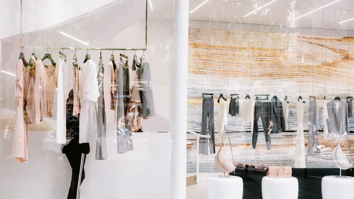
Symmetrical vs. Asymmetrical Balance
Symmetrical balance is easy to understand. You arrange elements of equal weight on either side of a central line. Imagine a large painting perfectly centered on a wall with two identical sculptures on each side. This creates a formal, calm, and orderly feeling. It works well for traditional or classical themes.
Asymmetrical balance offers a more dynamic and modern feel. It involves balancing different objects to achieve visual equilibrium. This approach creates energy and visual interest.
Tip: For a dynamic display, try grouping items in odd numbers like three or five. This technique avoids stiffness and adds a natural rhythm. You can also position a key artifact slightly off-center to create movement and guide the visitor's eye through the space.
Distributing Visual Weight
Every item in your exhibit has visual weight. This is the measure of its ability to attract a visitor's eye. You must distribute this weight carefully to create a balanced composition. Several factors determine an item's visual weight:
Size: Larger objects naturally appear heavier and draw more attention.
Color: Dark, warm, and saturated colors carry more weight than light, cool, or muted ones.
Texture: An object with a complex or rough texture feels heavier than a smooth one.
You can balance a single large artifact with a cluster of several smaller ones. Similarly, a small, brightly colored object can balance a larger, neutral-colored item. This principle also applies to your text panels. A large headline has more visual weight than smaller body text. Using a contrasting color or surrounding text with empty space also makes it stand out, helping you guide the visitor's reading path.
Emphasis: Creating a Focal Point

Emphasis is the principle of making one element stand out. You use it to create a focal point. This focal point is the first thing a visitor sees. It guides their attention and tells them where to begin their journey. A strong focal point prevents visual confusion and makes your exhibit more impactful.
Strategic Use of Lighting
Lighting is one of your most powerful tools. It sets the mood and directs attention. You should first light the room evenly for visitor comfort. Then, you can add layers of light for emphasis. Ambient lighting establishes the overall tone of your space. Warmer tones can create a sense of comfort for a historical exhibit. Cooler tones might convey a modern feel for a science display.
After setting the mood, you can use spotlights to highlight key artifacts. This technique brings up the light levels on specific pieces.
Use adjustable spotlights to draw focus to your most important items.
Position lights at careful angles to minimize glare and reflections.
Combine spotlights with softer, auxiliary lighting to add depth and prevent harsh shadows.
The Power of a 'Hero' Artifact
A 'hero' artifact is a central, high-impact item that anchors your exhibit. You should select an object that is visually impressive or deeply significant to your story. Position this hero item strategically. It should be visible from a distance to draw visitors into the space. You can place it in a central hub or at the entrance to a featured area. Leveraging oversized graphics or a unique display case can turn this single artifact into a can't-miss landmark.
Tip: Think of your hero artifact as the star of the show. Give it a prime location and the space it needs to capture attention. This single decision can define the entire visitor experience for that exhibit.
Applying Color and Contrast
Color and contrast are essential visual merchandising principles that command attention. You can use them to make your focal point pop. Using contrasting colors makes artifacts stand out. For example, you can place a red ceramic piece against a cool, muted green wall for maximum visual impact. A brightly lit sculpture against a dark wall also becomes an immediate focal point. This high contrast between light and dark clarifies an object's form. You can also apply this to text. Using a bold, large headline creates sharp visual separation and emphasizes your key message.
Flow: Designing the Visitor Journey
Flow is about how you guide visitors through your space. A good flow creates a clear, stress-free path that tells your story in the right order. Research shows that visitors often follow predictable routes. They tend to explore exhibits along the perimeter of a room and prefer paths with some turns. Your job is to make this journey intentional and intuitive.
Mapping an Intuitive Path
You can map an intuitive path using simple visual cues. These signals tell visitors where to go without them having to think about it. This makes the experience feel seamless and natural. You can use flooring, lighting, and partitions to create a clear route. For example, a change in floor texture or a colored line can guide people forward. Brightly lit pathways show the main route, while softer light can suggest areas for rest.
Think of it like giving simple directions. Instead of a complicated map, you can tell someone, "Just follow the yellow line on the floor. When you reach the hanging lights, you’re there."
Here are a few ways to create a clear path:
Use directional patterns in flooring to point the way.
Arrange partitions to create clear boundaries and walkways.
Place your most important exhibits in a sequence that tells a story.
Using 'Decompression Zones'
Every journey needs a starting point. The first 5 to 15 feet inside your entrance is the 'decompression zone'. This is a critical space where visitors transition from the outside world. They need a moment to adjust to the new lighting, sounds, and overall environment.
This zone helps visitors slow down and mentally prepare for the experience. It prevents them from feeling overwhelmed. For this reason, you should avoid placing any critical information or displays directly inside the entrance. Studies show that people often walk right past them. Instead, keep this area open and calm. Use it to set the mood and give visitors their first positive impression before they begin their journey.
Storytelling: Weaving a Cohesive Narrative
Your exhibit is more than a collection of objects; it tells a story. Good storytelling turns a passive viewing into an active experience. You can guide visitors through a narrative by carefully arranging your items and text. This creates a memorable journey from beginning to end.
Thematic Grouping of Items
Grouping items by theme helps you tell a clear story. Instead of arranging objects by date or size, you can organize them around a central idea. This approach makes complex topics easier to understand. For example, the National Museum of American Diplomacy uses this method effectively. They created modules for specific themes.
Each module tells three stories: one historic, one modern, and one unusual.
They use artifacts and short videos to support each theme.
A special section connects the theme to current events.
This strategy helps visitors connect different items to a single, powerful message.
Applying the 'Rule of Three'
The 'Rule of Three' is a simple but effective design trick. It suggests that grouping items in threes is more visually appealing and memorable. An odd number of items creates a sense of movement and energy.
In visual merchandising, they have the rule of three where they try to work in sets of three when arranging products. This rule helps the eyes move by creating asymmetry.
You can apply this rule to almost anything. Arrange three related artifacts together. Use three text panels to explain a concept. This small change can make your displays feel more dynamic and natural.
Visual Hierarchy for Text Panels
Your text panels guide visitors through your story. A clear visual hierarchy tells them what to read first. You can create this hierarchy using size, color, and space. Make your main titles the largest. Use a smaller font for subtitles and body text. This simple difference in size directs the eye. High contrast between text and its background makes words easy to read. Placing related text and images close together also shows they are connected.
Using these principles ensures your key messages stand out and your story is easy to follow.
Sensory Engagement: A Guide for 2025
Engaging multiple senses creates stronger memories and deeper understanding for your visitors. When you appeal to sight, sound, and touch, you make learning more inclusive and impactful. This approach turns your space into a living experience that builds a real emotional connection with your audience.
Integrating Digital and Interactive Displays
Modern digital tools can bring your stories to life. You can use them to add layers of information without distracting from your artifacts. Augmented Reality (AR), for example, lets visitors use a phone to see a digital reconstruction over a real object. Virtual Reality (VR) can transport them to a place they cannot physically visit, like an ancient city.
Tip: Place digital tools strategically. An interactive touch screen can sit next to a display case, offering deeper context without blocking the view. You can also use projection mapping to turn an entire wall into a dynamic backdrop, creating an immersive journey without physical screens.
Successful museums like the Cooper Hewitt Smithsonian Design Museum use these tools to connect physical objects with virtual media, enriching the visitor experience.
Incorporating Texture and Sound
You can tell a story using more than just visuals. Texture and sound create a powerful atmosphere and invite interaction.
Texture: Use different materials to guide feelings. Warm wood can feel inviting, while sleek metal can feel modern. You can add textured panels to walls or use varied flooring materials. These surfaces invite touch and make the environment more interesting.
Sound: Audio adds an invisible layer of immersion. You can use sound to create a specific mood or provide information. Consider these options:
Sense | Purpose | Examples |
|---|---|---|
Sound | Creates atmosphere and triggers emotion | |
Touch | Encourages direct engagement | Tactile replicas, textured walls |
Smell | Evokes memory and place | Scent diffusers for thematic aromas |
A subtle soundscape, like desert winds in an exhibit on ancient Egypt, can make the experience feel more authentic and memorable.
You now have a guide to core visual merchandising principles. You can use them to create a better visitor experience. These principles help you tell a compelling story with your objects.
Balance
Emphasis
Flow
Sensory Engagement
Applying these visual merchandising principles transforms your space from a simple collection into a captivating narrative.
Start with one exhibit. Try improving just one element, like its focal point or the flow around it. Then, observe the impact on visitor engagement.
FAQ
How can I apply these principles on a small budget?
You can make big changes with little cost. Focus on rearranging existing items to improve flow and balance. Use paint to create a contrasting accent wall for emphasis. Adjusting your current lighting to spotlight a hero artifact is also a powerful, low-cost strategy.
Will visual merchandising make my museum feel like a store?
No, the goal is different. Retail uses these principles to sell products. You use them to tell a story and guide learning. Your focus on narrative and education ensures the space remains a cultural institution, not a commercial one. It enhances the visitor's understanding.
What is the first principle I should focus on?
Start with Emphasis. Creating a clear focal point is the easiest way to make an immediate impact. Choose one hero artifact in an exhibit. Then, use lighting or placement to draw attention to it. This single change can improve a visitor's entire experience.
How do I know if my changes are working?
You can observe visitor behavior. Watch where people go first and how long they stay at an exhibit. You can also ask for feedback directly.
Tip: Pay attention to "desire lines." These are the natural paths visitors take. They show you if your intended flow is working.