Visual Merchandising Principles for Exhibit Agencies
An exhibit booth is your brand’s physical handshake at crowded trade shows. You need a strong visual merchandising strategy to make that first impression count. Visual merchandising principles use displays, space, and design to create a memorable customer experience. This strategy helps attract customers and boost engagement. Nearly half of exhibitors believe an eye-catching booth design is vital for drawing in attendees. Your booth is a powerful tool. A well-designed booth transforms a simple space into an immersive brand world.
Core Visual Merchandising Principles for Exhibits
You can transform your vendor booth from a simple space into a powerful magnet for attendees. Your visual merchandising strategy should include the key elements of visual merchandising. These foundational visual merchandising principles will help you build a booth that works.
The Power of Balance and Repetition
Balance gives your vendor booth a stable and professional feel. It refers to the visual weight of your product displays and graphics. You can use two main types of balance in your booth.
- Symmetrical balance creates a mirror image. This formal look feels very organized.
- Asymmetrical balance uses different elements with equal visual weight. This creates a more dynamic and modern feel for your booth.
Repetition creates a cohesive theme and guides the eye. You can repeat colors, shapes, or your logo throughout the vendor booth. This makes your brand message clear. One of the best visual merchandising tips is using the "Rule of Three."
Pro Tip: Arrange items in groups of three to create more engaging and creative displays. The human eye finds odd-numbered groupings, like in these product displays, more interesting. This simple trick makes your vendor booth more appealing.
This rule helps make your product displays in the booth feel intentional and well-designed. A well-balanced booth is more inviting.
Using Contrast to Create Emphasis
Contrast helps you draw attention to the most important parts of your vendor booth. You can use color, size, or shape to create it. A powerful but simple tool for contrast is negative space. This is the empty area around an object or text. Using plenty of negative space makes your main message or product pop.
Imagine placing one hero product on a large, clean table. The empty space frames the item. This makes it the undeniable focal point of that product display. This technique ensures attendees see exactly what you want them to see. It guides their eyes and makes your vendor booth easier to understand. A simple design for your booth can be very effective. Your booth will look clean and professional. Applying these visual merchandising principles will make your vendor booth a success.
Create a Powerful Focal Point
Your focal point is the first thing an attendee sees at busy trade shows. It acts as a visual magnet, drawing people in from a crowded aisle. You should place this main attraction at eye level for maximum impact. A strong focal point makes your vendor booth impossible to ignore. It is the anchor of your entire booth design.
Establish a Central Visual Anchor
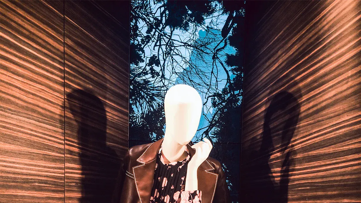
A central visual anchor gives your vendor booth a clear point of interest. It guides the eye and communicates your most important message instantly. You can create this anchor with a stunning architectural element. Unique structures like tension fabric arches or tall display towers help your booth stand out at a vendor fair. These designs create a captivating vendor booth that draws people in from far away.
Another powerful option is a large-scale video wall. Digital displays are common in airports and shopping malls for a reason. They grab attention. You can use a large screen in your vendor booth to show dynamic brand stories or product videos. This technology transforms your booth into an immersive and memorable experience. It makes your vendor booth a destination, not just a stop.
Practical Vendor Booth Ideas for a Focal Point
You can use many creative vendor booth ideas to create a focal point. The goal is to make your booth interactive and engaging. One of the best visual merchandising tips is to build your main feature around direct attendee participation.
Here are some practical vendor booth ideas to get you started:
- Live Demonstrations: Show your product in action. A live demo or a mini-workshop allows visitors to experience your product’s value firsthand. These product displays are very effective.
- Interactive Product Displays: Let people touch and feel your products. You can set up a central table to display your products. Place your most popular items front and center. You can also use tablets with digital catalogs or augmented reality features to create engaging product displays.
- Selfie Stations: Create a fun, branded backdrop. A selfie station encourages visitors to take photos and share them on social media. This turns your vendor booth into a shareable experience and generates buzz for your brand.
These vendor booth ideas help make your product displays the star of the show. An interactive focal point makes your booth a must-see attraction.
Use Color Psychology to Influence Mood
Color is a powerful tool for your vendor booth. It influences mood and changes how people see your brand. Your brain processes color on a deep emotional level. This affects how attendees feel before they even think about it. The right colors can make your vendor booth feel exciting, calm, or luxurious. A strategic color palette helps your booth connect with visitors and reinforces your company's values.
Align Colors with Your Brand Message
You should align the colors in your vendor booth with your brand's core message. Different colors create different feelings. For example, many top tech brands like IBM use blue in their booth to show stability and build trust. Your color choice can instantly communicate your brand's personality. A well-chosen palette makes your vendor booth more memorable.
Consider these color palettes for your booth:
- Icy Blues & Silver: This combination makes your vendor booth feel calm and sophisticated. It is great for a booth focused on networking.
- Vibrant Jewel Tones: Colors like sapphire and ruby make your vendor booth feel luxurious and creative. They are perfect for a fashion or artistic brand's booth.
- Classic Red & Gold: This pairing creates an energetic and celebratory mood. It helps your vendor booth feel opulent and successful.
Choosing the right colors ensures the atmosphere of your booth matches your brand identity.
Use High-Contrast for Key Call-to-Actions
You need to make your most important messages easy to see. High-contrast colors help your key call-to-actions (CTAs) stand out in a busy vendor booth. A CTA button or sign must grab attention from a distance. The best practice is to use a color that contrasts sharply with the background of your booth. For example, a bright orange button on a neutral background is very effective.
You can use your brand's secondary colors for these elements. This adds visual interest without confusing your primary brand message. Use these colors for things like digital buttons or charts inside your vendor booth. For text, always ensure high contrast. Dark text on a light background or light text on a dark background is easiest to read. This simple rule makes your entire vendor booth more user-friendly and helps guide attendees to take action. A clear CTA can make a big difference for your booth.
Implement Strategic Lighting
Lighting does more than just illuminate your vendor booth; it creates an atmosphere. The right lighting strategy can transform a simple booth into an engaging environment. Your choices for lighting and ambiance set the overall tone. Accent lighting, on the other hand, highlights your most important products or messages. A thoughtful lighting plan makes your vendor booth a standout destination.
Set the Mood with Ambient Light
Ambient light sets the general mood for your entire vendor booth. It is the foundation of your lighting design. You can use programmable RGB lighting to create dynamic color changes throughout the event. This technology allows your vendor booth to shift from a high-energy vibe to a calm, futuristic look with cool blues.
Pro Tip: Use backlighting to make your graphics and logos glow. Techniques like halo-lit 3D lettering give your vendor booth a modern, welcoming feel. Edge-lit panels can also create sharp, evenly lit graphics that make your booth look polished and professional.
This approach helps reinforce your brand identity. A well-lit booth feels more inviting and keeps attendees engaged. The right ambient light makes your vendor booth a memorable space. This is a key part of designing a successful booth.
Highlight Products with Accent Lighting
Accent lighting draws the eye to specific points of interest. You can use it to spotlight your hero products or key information panels. This technique ensures attendees see exactly what you want them to see. Your product displays will command attention with the right spotlights.
You have several effective options for your booth.
- Narrow beam spotlights create bright, high-contrast highlights. They make key product displays pop.
- Zoom spotlights offer great flexibility. You can adjust the beam to perfectly frame objects of any size within the vendor booth.
- LED focus spotlights provide intense, adjustable light. They add drama to your product displays.
Always choose fixtures with a high Color Rendering Index (CRI). A CRI of 90+ ensures your brand colors and product displays appear vibrant and accurate. This detail is crucial for representing your brand correctly in the booth. Proper accent lighting turns your vendor booth into a professional showcase. Your booth will look its best.
Design an Engaging Vendor Booth Layout
Your vendor booth layout is more than just furniture placement; it is the blueprint for the attendee experience. Smart layouts guide visitors on a journey, making your booth a destination rather than a simple stop. When planning your vendor booth, you should choose the right booth layout to control traffic and create a natural flow. This ensures every part of your vendor booth contributes to your goals at trade shows.
Guide the Attendee Journey
You can direct how people move through your vendor booth with a thoughtful design. Most attendees turn right when they enter a hall, so place your main attraction where they will see it first. Your initial planning your vendor booth should map out clear entry and exit points. Open entrances invite people into the booth, while clear pathways prevent crowding.
You can use flooring to guide visitors without using physical walls. These are great vendor booth ideas for creating flow.
- Floor Graphics: Use printed footprints or arrows on the floor to create a path. These silent guides lead people to key areas of your vendor booth.
- Carpet Colors: Use different carpet colors or textures to define zones. A shift from a bright color to a calmer one can signal a move from a product area to a meeting space within the booth.
These techniques help you manage traffic and ensure visitors explore your entire booth.
Tell a Story with Your Layout
Your vendor booth layouts should tell your brand's story. You can create a narrative by arranging different zones in a specific order. This is one of the best visual merchandising tips for creating a memorable booth. Start with a welcome area, lead into product demonstrations, and end with a private space for deeper conversations. This structure creates a journey of discovery.
Create a path that moves attendees from initial curiosity to deep engagement. Your layout should guide them from a wide-open welcome area to focused interaction zones for product demonstrations or one-on-one meetings.
This approach makes your vendor booth more effective for engaging with customers. Smart layouts encourage interaction and improve customer engagement. For example, you can design a U-shaped path that takes visitors past all your key displays and demonstrations. This ensures they see everything your booth has to offer. These vendor booth ideas turn your space into an interactive story. The right layouts make your vendor booth a powerful tool for connection.
Utilize Effective Signage and Graphics
Your signage and graphics must communicate your message instantly. Attendees at a trade show are constantly moving and scanning. You have only a few seconds to capture their attention. Clear, concise graphics make your booth easy to understand from a distance. This helps draw the right people to your booth.
Communicate Your Message Quickly
You need to deliver your main point in a single glance. Your primary headline should be short and impactful. A good rule is to keep headlines between five and seven words. This forces you to be concise. Your message must be clear enough for someone walking by your booth to grasp immediately. The size of your booth also affects how much text you can use effectively.

Short messages help people quickly decide if your booth is relevant to them. This makes your entire booth more efficient.
Create a Clear Information Hierarchy
An information hierarchy guides the reader's eye through your text. You can use different font sizes and styles to show what is most important. Your main title should be the largest, followed by subtitles, and then body text. This structure makes your information digestible.
- Titles: Use large, bold fonts to grab attention from across the aisle.
- Subtitles: Provide more context in a slightly smaller font.
- Body Text: Keep this for detailed information that people can read once they are inside your booth.
Readability from different distances is crucial. A general rule suggests a 24-point font minimum for text at eye level in your booth. However, you must increase the font size for longer viewing distances. For example, text viewed from 3 meters away may need a font size of nearly 150 points.

Always ensure there is at least 70% contrast between your text and the background. This simple step makes every sign in your booth easier to read. A well-organized hierarchy makes your booth look professional and user-friendly. This improves the overall experience at your booth.
You now have a toolkit of visual merchandising principles for your booth. This guide covered the key elements of visual merchandising.
- Balance and Repetition
- A Strong Focal Point
- Color and Lighting
- Booth Flow and Signage
Applying these visual merchandising principles transforms your simple booth into an immersive experience. A strategic booth helps you achieve client goals. This approach to your booth design ensures vendor booth success. Your booth will generate leads and build brand awareness. Make your next booth your best booth. This booth will be a great booth. Your booth will be a success.
FAQ
How can I make my small booth feel bigger?
Use light colors and mirrors in your booth. This makes your booth feel more open. A clean booth design also helps. Keep your booth uncluttered to maximize space. A well-organized booth appears larger. Your small booth can have a big impact.
What is the most important element for a new booth?
A strong focal point is vital for your new booth. It draws people to your booth from the aisle. This single element defines your entire booth. Make sure your booth has one clear anchor. A great booth always starts with a focal point. Your booth needs this.
How often should I use my logo in the booth?
Use your logo strategically in the booth. Place it on the main sign for your booth. You can also add it to a welcome counter inside the booth. Repetition reinforces your brand, but do not clutter the booth. Every element in the booth should have a purpose.
Can I mix different styles in my booth?
Yes, you can mix styles in your booth. Your booth should still have a cohesive theme. An asymmetrical layout can make your booth feel dynamic. The overall design of your booth must tell a clear story. A successful booth feels intentional. Your booth can be unique.