Small-Space Merchandising for Museums
Successful museum shops depend on two key principles: maximizing vertical space and creating focused visual interest. Your shop is a vital asset. You can use practical small-space merchandising strategies to transform cramped corners into profitable displays.
Your store can be a major earner. Shops often contribute 5% to 25% of a museum's total revenue.
These tactics help you display existing inventory more effectively. This boosts sales and enhances the visitor experience. A high purchase rate is achievable. For instance, 80 percent of visitors bought a souvenir at Peale's historic museum.
Strategic Layout and Flow
An effective layout is the foundation of successful Small-space merchandising. Your goal is to guide visitors on a seamless journey from the entrance to the checkout counter. A well-planned space improves customer flow, increases product visibility, and can directly boost your sales per square foot.
Planning Your Floor Plan
First, think about your shop from above. Imagine a bird's-eye view to map out the entire space. This helps you identify congested or underused areas. For smaller shops, a free-flow layout works very well. It allows shoppers to browse at their own pace and gives you creative freedom. You can easily switch up displays and create special focus zones. This open plan also makes your most important displays, like a "power wall," visible from almost anywhere in the store. Using flexible and modular fixtures allows you to adapt the layout for new exhibits or inventory.
Tip: A low sales per square foot figure might indicate underutilized space. Use this metric to see if your layout and merchandising efforts are working effectively.
Creating Clear Pathways
Your visitors need room to move comfortably. Bottlenecks are a common problem in small shops. For example, the Brooklyn Museum Shop once had a small, enclosed vestibule that blocked visibility and created a traffic jam. Removing a wall opened up the space and improved customer flow dramatically. You can prevent these issues by creating clear, intuitive pathways.
- Ensure pathways are at least 36 inches wide. This width accommodates customers using wheelchairs or strollers, making your shop accessible and comfortable for everyone.
- Avoid dead ends. Every path should lead customers to a new discovery.
Designing for Visual Sightlines
Your store's entrance is your first opportunity to guide the customer's eye. Stand at the doorway and see what is immediately visible. You should have clear sightlines to your most important product categories and promotional displays. This encourages visitors to explore deeper into the store.
You can also use "speed bumps"—small, eye-catching displays placed in high-traffic paths. These displays interrupt a customer's journey and draw their focus to specific products. Placing high-margin items on end-caps at the end of aisles also captures maximum attention. A clear visual path makes the shopping experience logical and enjoyable.
Mastering Vertical Space
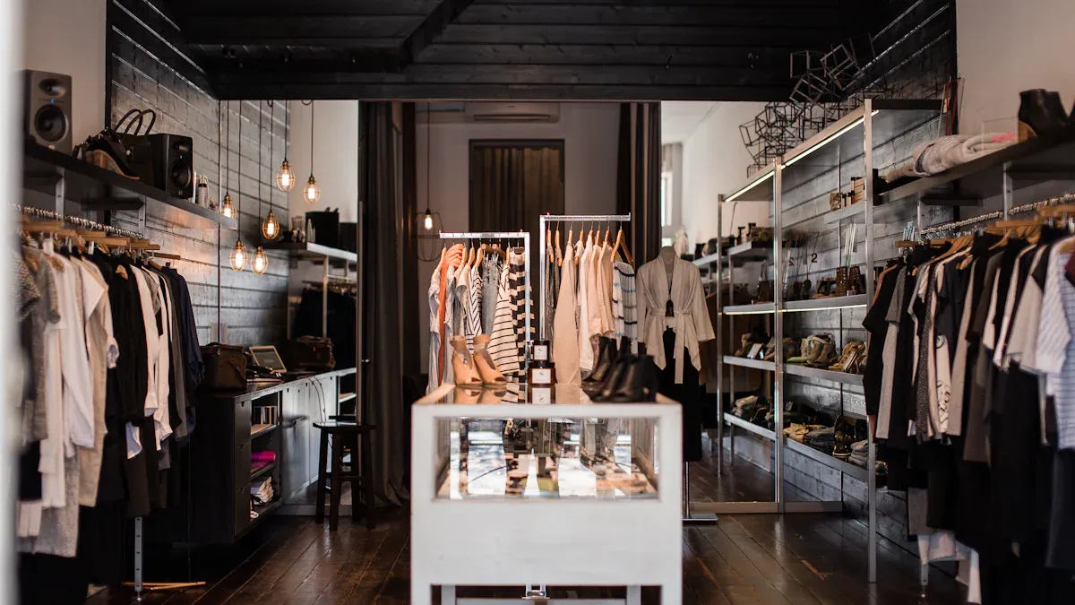
When floor space is limited, the only way to go is up. You can draw the customer's eye upward to make your shop feel larger and more dynamic. Vertical merchandising allows you to display more products without adding clutter. This approach transforms your walls and shelves into valuable selling real estate.
Using Multi-Level Risers
Multi-level risers are simple tools that create instant height and visual appeal. They elevate products, ensuring that items at the back of a shelf are just as visible as those in the front. This technique is a cornerstone of effective Small-space merchandising.
You have many options for risers. Each offers a different look and feel for your displays.
- Acrylic Risers: These are clear, durable, and lightweight. They give a modern, clean look and make products appear to float.
- Wood Block Risers: Sets of wooden blocks in various heights add a natural, sturdy feel. They are perfect for showcasing artisan goods or exhibit-related books.
- Nesting Risers: These sets can stack or nest inside each other. You can easily adjust them for different product sizes and create dynamic, modular displays.
Using risers directly impacts customer behavior. Retail expert James Ellis notes that elevating smaller products to eye level with step risers increases impulse purchases. Items on the top step catch a customer's attention. This leads to more unplanned buys. Additionally, Mark Carter states that multi-level risers maximize shelf space. They let you display more products vertically, creating an organized flow where customers see all options at a glance.
Creative Product Stacking
You do not always need special fixtures to create height. You can use your own inventory to build interesting, multi-level displays. This is a cost-effective way to add dimension and texture.
Try these stacking techniques for items like books or boxed goods:
- Mix Orientations: Stack some books horizontally and place others vertically on top. This breaks up monotonous lines and creates small platforms for other items.
- Create Color Stories: Arrange products by color. A rainbow of book spines or a group of monochrome boxes creates a powerful visual statement that draws shoppers in.
- Layer for Depth: Place larger items in the back and smaller ones in the front. You can use a horizontal stack of books as a riser to elevate a smaller, high-margin object.
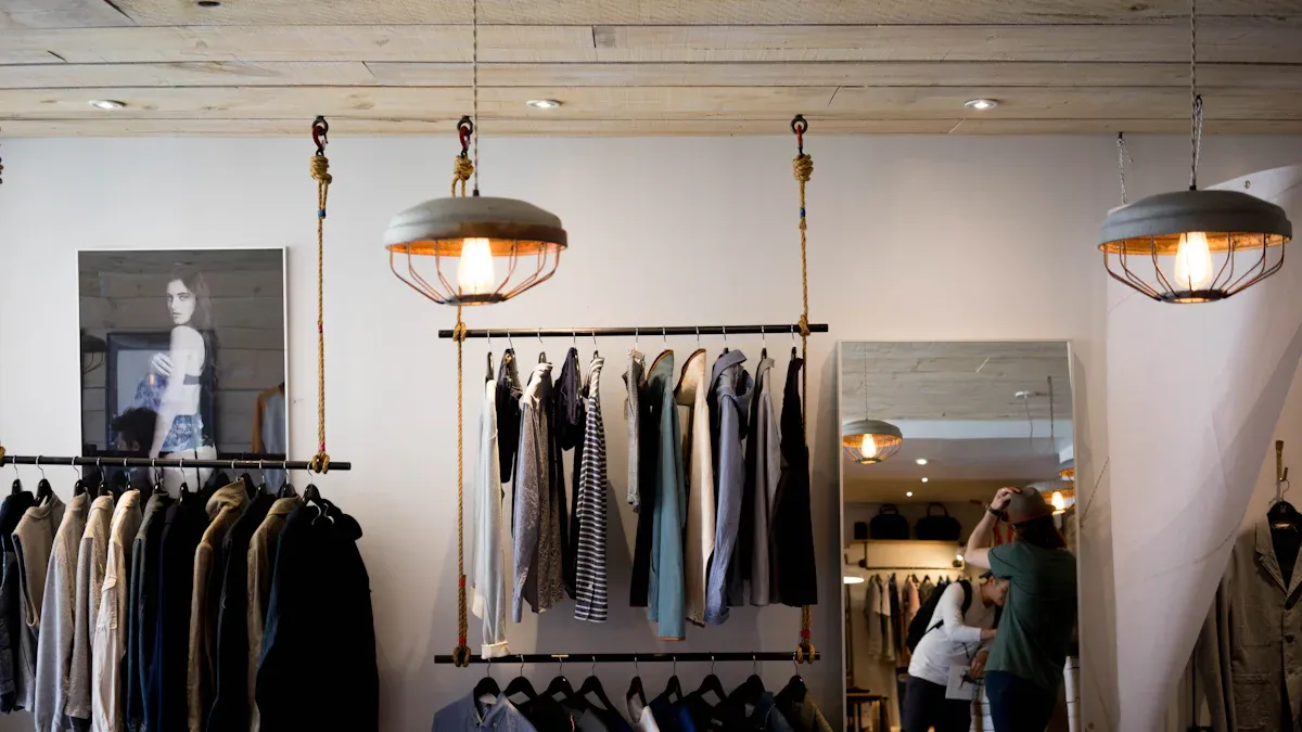
Installing Wall-Mounted Fixtures
Your walls offer a blank canvas for merchandising. Getting products off the floor and onto the walls frees up valuable pathway space and draws attention upward.
Many types of wall fixtures work well in small shops:
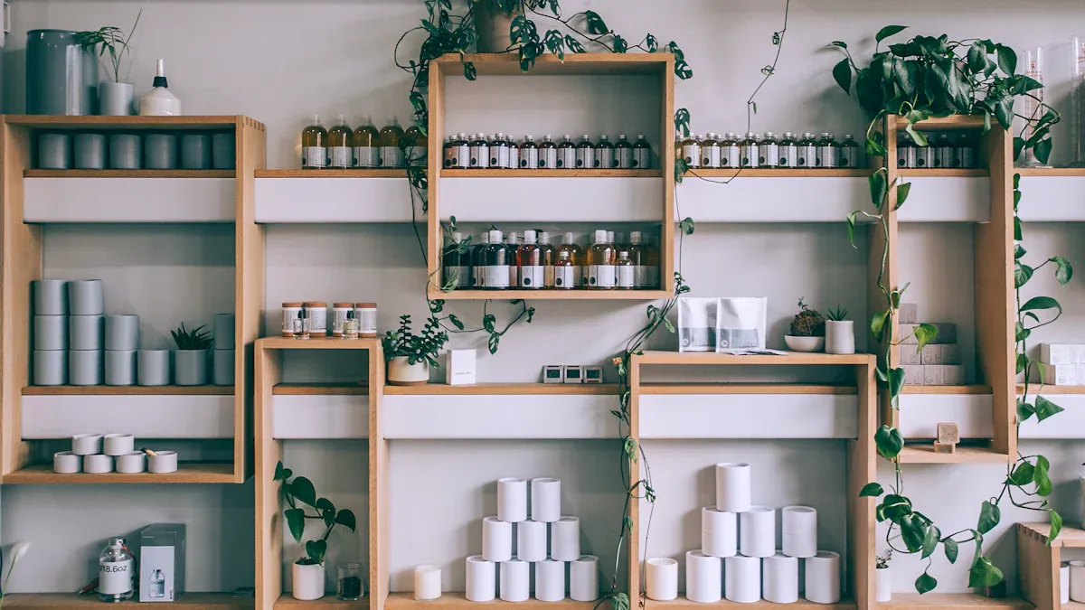
- Floating Shelves: These create a minimalist look and make the space feel open.
- Slatwall and Pegboard Panels: These systems offer incredible flexibility. You can easily move hooks, shelves, and bins to change displays for new exhibits or seasons.
- Picture Ledges: These narrow shelves are perfect for displaying books, prints, and small decorative items without taking up much room.
Safety First: Know Your Limits Before you install wall shelves, you must consider weight. A typical medium-duty shelf can hold 20-50 pounds. Always mount shelves into wall studs for the strongest support. Use high-quality hardware and follow the manufacturer's guidelines to ensure your displays are safe and secure.
Adding Shelf Extenders and Dividers
You can make your existing shelves work harder. Shelf extenders and dividers help you organize products, prevent messes, and display more items in a small area.
Magnetic Shelf Dividers are a game-changer for metal shelving.
- They create clean, organized compartments for different products.
- You can easily move them to change compartment sizes.
- They are reusable and require no messy adhesive.
- Keeping products neatly separated helps maintain price label integrity and makes shelves look professional.
Wire Power Wings are another useful tool. These are small wire racks that attach to the side of your end-caps. They are perfect for capturing last-minute sales. Use them to display impulse items like:
- Snacks and drinks
- Phone chargers
- Small, seasonal items
- Bottle openers next to a display of glassware
These simple additions maximize every inch of your retail space and can significantly boost sales.
Core Tactics for Small-Space Merchandising
Beyond layout and verticality, the way you arrange products creates visual harmony. These core tactics help you tell stories, guide attention, and make your displays more appealing. Thoughtful arrangement transforms a simple product collection into an engaging experience for your visitors.
Grouping by Theme or Story
Your merchandise can tell a story that connects directly to the museum's collections. This approach creates a narrative that captivates shoppers and encourages them to take a piece of the experience home. You are not just selling products; you are crafting a story.
A great way to start is by working with your museum's curators.
- Collaborate Early: Talk with curators long before a new exhibition opens.
- Identify Key Themes: Pinpoint the main ideas, important artists, or historical details of the exhibit.
- Develop Merchandise: Use this information to source or create exclusive items. This could include catalogs, prints, or custom jewelry that reflects the exhibition's style.
Once you have your products, design displays that create narrative vignettes. This is a key part of effective Small-space merchandising. For example, a display about ancient Rome could feature pottery replicas, books on Roman art, and artisanal goods inspired by Roman designs. This grouping tells a cohesive story and helps customers see how different items relate to one another.
This thematic approach helps customers envision how products fit into a larger story. A cozy, themed display can inspire purchasing decisions by creating an emotional connection.
Using Color to Guide the Eye
Color is a powerful tool in retail. It shapes how customers perceive your products and can guide their behavior. Different colors create specific emotions and can draw attention to key areas of your shop.
You can use color psychology to your advantage.
- Warm vs. Cool Colors: Use warm colors like red and orange near the entrance to create energy. Use cool colors like blue and green in the back of the store to create a calm feeling that encourages browsing.
- Complementary Colors: Pair colors from opposite sides of the color wheel, like blue and orange. This creates a vibrant, eye-catching display.
- Accent Colors: Use small pops of a bright color, like yellow, against a neutral background. This technique draws immediate attention to a specific product or display.
Color blocking is another effective strategy. The retailer Petite Studio NYC groups items by similar colors. This creates a clean, organized flow that makes the store feel more sophisticated. You can group all your blue items together, then all your yellow items. This simple technique makes your displays look intentional and visually pleasing. For best results, limit your displays to a maximum of three colors to avoid a cluttered look.
Layering Textures for Depth
Mixing different materials adds depth and makes your displays more interesting to look at and touch. A flat, one-dimensional display can feel boring. Layering textures creates a rich visual story that invites customers to take a closer look.
You can easily mix materials like wood, glass, fabric, and metal to create dynamic displays. Consider these pairings to create different effects:
| Texture Pairing | Visual Effect | Common Applications |
|---|---|---|
| Wood + Metal | Rustic-modern fusion | Signage, accent pieces, furniture |
| Fabric + Glass | Soft and elegant | Draped backdrops, jewelry cases |
| Stone + Greenery | Natural and organic | Risers, decorative accents, plant displays |
When arranging items on a shelf, use layering to create dimension.
- Start with anchor pieces. Place larger items like sculptures or framed prints in the back.
- Add medium-sized items. Place complementary products like books or candles in front of the anchor pieces.
- Finish with small accents. Fill in the foreground with small items like decorative stones or miniature plants.
This tiered approach ensures every product is visible. It also creates a sense of rhythm that guides the eye across the display.
Applying the Rule of Three
The Rule of Three is a simple but powerful design principle. It states that items arranged in odd numbers, particularly in groups of three, are more appealing and memorable to the human brain. An even-numbered group can look static, but a group of three creates a sense of balance and completeness.
"In Western culture, the number 3 is omnipresent because it makes decision-making easier," explains one retail expert. "It's a major triangular system for analyzing and reflecting on purchasing behavior."
You can apply this rule everywhere in your shop.
- Product Groupings: Display three related items together, like a book, a matching bookmark, and a pen. This tells a mini-story and encourages multiple purchases.
- Shelf Displays: Arrange three decorative objects on a shelf, such as a small vase, a stacked set of coasters, and a framed postcard.
- Varying Height: Create a triangular shape by placing a tall item in the middle and two shorter items on either side.
This technique works because it feels complete and creates a natural rhythm. Your eye flows easily from one item to the next. Using the Rule of Three helps you build balanced, harmonious displays that capture customer attention without overwhelming them.
Enhancing Displays with Light
Proper lighting is more than just helping visitors see. It is a powerful tool that guides attention, creates mood, and can make your small shop feel more spacious. You can use light to turn simple shelves into captivating showcases and drive sales.
Using Strategic Spotlighting
Spotlights act like a visual magnet, drawing a customer’s eye directly to key products. Strategic lighting can boost sales significantly by making certain items impossible to ignore. However, you must control glare, especially with shiny objects like glass or jewelry.
You can easily reduce unwanted reflections.
- Use diffusers like a sheer white cloth to soften harsh light.
- Adjust the angle of your products away from the light source.
- Light reflective items from the side or overhead instead of directly from the front.
Illuminating Dark Corners
Dark corners make a shop feel smaller and can hide valuable inventory. Brightening these forgotten spaces makes your entire retail area feel more open and inviting. You do not need an expensive overhaul to fix this.
Cost-effective solutions can have a big impact. Consider using adjustable track lighting to aim light exactly where you need it. You can also install LED recessed lights for a clean, modern look. Even a well-placed floor lamp can add warmth and eliminate shadows in a dim area.
Integrating In-Shelf Lighting
Bring light directly to your merchandise with in-shelf illumination. This technique ensures that products on every level get attention, not just those at eye level. It gives your displays a professional, high-end feel.
Flexible LED strip lights are an excellent choice for this.
- COB LED strips provide a smooth, even glow without dots.
- You can cut the strips to fit any shelf length.
- Install them inside recessed channels for a seamless, built-in appearance.
Highlighting High-Margin Products
Use light to put a virtual spotlight on your most profitable items. Bright, focused lighting makes these products stand out, even in a crowded display. This simple trick encourages impulse buys and boosts your bottom line. You can use backlighting behind a key item to make it pop. Using cool, white LED lights also helps product colors appear true and sharp. This focused illumination visually interrupts a shopper's journey and directs their focus right where you want it.
You learned how to use strategic layouts, vertical displays, visual tactics, and lighting. Your small retail footprint can become a major asset with thoughtful Small-space merchandising.
Take Action! 🚀 Experiment with these tricks to see what works best. You should regularly refresh your displays. This keeps them looking new and engaging for repeat visitors.
FAQ
How often should I change my displays?
You should refresh your displays every 4 to 6 weeks. This practice keeps your shop looking new for repeat visitors. It also lets you align merchandise with new museum exhibits. A simple change can boost visitor engagement and sales.
What is the most important first step?
Start by planning your floor plan. Imagine your shop from above to find bottlenecks or unused space. A good layout guides customers smoothly. It also makes your key products more visible from the entrance.
How can I make my small shop feel bigger?
You can make your shop feel bigger with two key tricks. First, use vertical space with wall shelves and risers. Second, add bright lighting to eliminate dark corners. These strategies draw the eye upward and create an open, airy feeling.
What is the easiest merchandising rule to apply?
The Rule of Three is a simple and effective trick. You can group products in sets of three. This creates a balanced, visually appealing display. This method helps guide the customer's eye and makes your arrangements look more professional.