Logo Printing Color Matching Guide 2025
Achieving perfect color in logo printing on acrylic requires a precise process. Success depends on four key elements working together. A designer must first choose the correct Pantone system for accurate color specification. Next, they use a calibrated digital workflow for consistent color data. The right printing technology ensures the intended color translates to the material. Finally, physical proofs confirm the final color appearance before full production. This methodical approach guarantees brand color integrity.
Pantone and Your Visual Branding
Color is a cornerstone of effective visual branding. It communicates a brand's identity and influences perception through color psychology. A consistent color strengthens this visual branding. Global brands understand this power. Coca-Cola uses a specific red for its branding. Tiffany & Co. has its iconic blue. These companies rely on the Pantone Matching System (PMS) for their visual branding. This system ensures their unique color appears the same everywhere. This consistency is vital for strong branding and visual recognition. The right color builds an immediate connection, a key goal of visual branding. This makes color selection a critical part of corporate branding strategy. The visual impact of consistent color psychology cannot be overstated for successful branding.
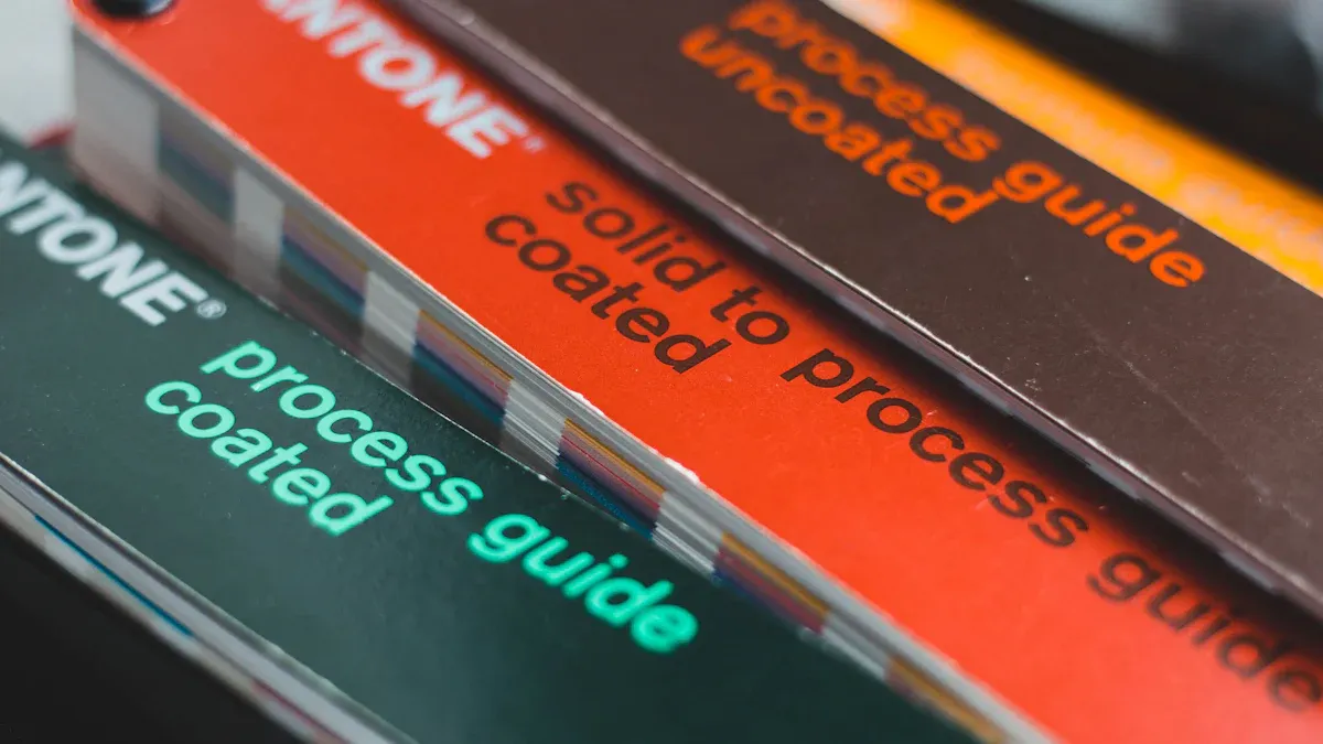
Using the Pantone Formula Guide
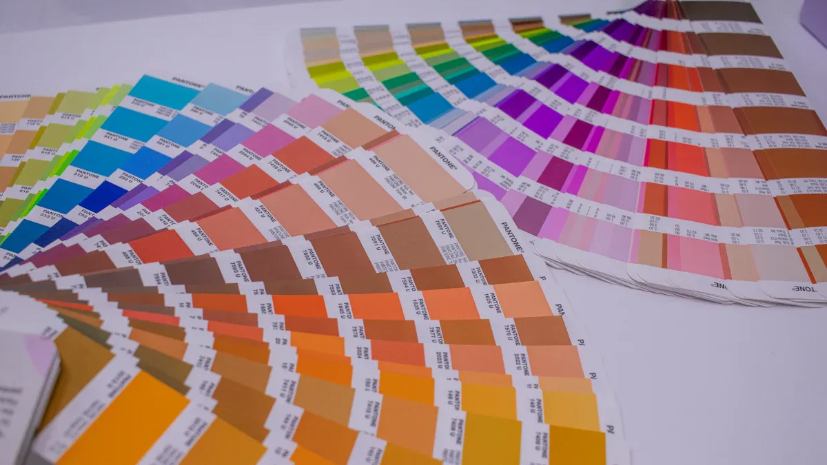
The Pantone Formula Guide is an essential tool for printers. It provides the exact ink mixing recipes to create a specific spot color. This guide acts as a universal language for color. It ensures designers and printers are aligned on the final visual output.
Each color receives a unique code (e.g., 'PMS 186 C').
This code eliminates guesswork in the printing process.
It guarantees the color remains consistent across different products.
The system uses pre-mixed 'spot' inks for a clean, predictable finish.
Printers use these formulas to mix base inks on-site. This process allows for precise color creation. It is fundamental to achieving the intended visual for any branding project. The guide ensures the final product matches the designer's visual intent, which is crucial for visual branding.
The Pitfall of CMYK Conversion
Designers often face the challenge of converting Pantone colors to CMYK. This conversion is a common pitfall in visual branding. It frequently leads to disappointing results. The primary issue is a difference in color gamut. CMYK printing uses four inks (Cyan, Magenta, Yellow, and Key/Black) to create colors. This process has limitations. It cannot replicate the full spectrum of vibrant pigments found in Pantone's spot inks.
Note: Converting a Pantone Solid Coated color to CMYK is not a reliable method. The resulting color often appears dull or different. This is because the CMYK process lacks the special pigments that give Pantone colors their unique 'snap' or vibrancy.
Different software programs also use their own conversion tables. This adds another layer of inconsistency. For perfect visual branding, specifying the exact Pantone color is the only way to guarantee accuracy. This protects the integrity of the branding and its associated color psychology. A brand's visual identity depends on this precision. Strong branding avoids such conversion issues. This maintains the power of color psychology in visual branding.
Key Methods for Logo Printing on Acrylic
Choosing the right printing method is vital for successful branding. The technology used directly impacts the final color, durability, and overall quality of the product. For a material like acrylic, specific techniques deliver superior results.
UV Direct-to-Substrate Printing
UV direct-to-substrate printing is a leading technology for applying graphics to rigid materials. This process involves a printer that deposits specialized ink directly onto the acrylic surface. Immediately after, high-intensity ultraviolet (UV) lights pass over the ink. This light triggers a chemical reaction. Photoinitiators in the ink cause polymers to crosslink and harden instantly. This process, known as curing, creates a strong bond between the ink and the non-porous surface.
This method is ideal for logo printing on acrylic for several reasons.
Vivid, Accurate Color: The ink cures instantly. This prevents it from spreading or soaking in, resulting in sharp lines and vibrant, photo-quality images.
Exceptional Durability: The cured ink forms a tough, scratch-resistant layer. A quality UV print can last 5-8 years indoors. Outdoor applications typically last 2-5 years, though advanced inks can extend this lifespan.
Speed and Efficiency: The instant drying time allows for faster production. This makes it excellent for projects with tight deadlines.
Eco-Friendlier Process: UV inks contain low amounts of volatile organic compounds (VOCs). The process produces less odor and heat, making it a safer choice for branding materials used indoors.
The Role of a White Ink Underbase A white ink underbase is essential for achieving a true and vibrant color on clear or colored acrylic. It acts as an opaque foundation. This base layer prevents the substrate's color from showing through and altering the logo's appearance. It ensures the final full-color print maintains its intended hue and brightness, which is critical for consistent branding. The white ink reflects light back through the colored inks, enhancing their saturation and depth for a high-quality finish.
A designer must also specify the print location on the material. This choice affects both appearance and longevity.
Feature | Second-Surface Printing (Reverse) | |
|---|---|---|
Appearance | Print is on the front surface. It often has a non-reflective, matte finish. | Print is on the back, viewed through the acrylic. This creates a glossy, deep, and vibrant look. |
Durability | The print is exposed. It is more susceptible to scratches and direct wear. | The acrylic itself protects the print. This makes it highly durable and ideal for high-traffic areas. |
Best For | Indoor displays where a non-glare finish is preferred for the branding. | Premium custom signage, outdoor displays, and any application needing maximum protection and a high-end look. |
Screen Printing and Vinyl Options
While UV printing offers superior flexibility and quality for most custom applications, other methods exist. Screen printing is a traditional technique that pushes ink through a mesh screen onto a surface. It can be cost-effective for very large production runs of simple designs. However, screen printing has high initial setup costs. This makes it expensive for small quantities or projects with multiple colors. For most modern logo printing needs, its limitations make it a less common choice.
Adhesive vinyl is another option. A company's logo is printed onto a sheet of vinyl, which is then applied to the acrylic. This method can produce good results initially. However, it has significant long-term durability issues.
Peeling: Over time, the adhesive can weaken. This causes the edges of the vinyl to lift and peel away, diminishing the professional look of the branding.
Fading: Exposure to sunlight breaks down the pigments in the vinyl ink. This leads to a dull and faded color.
Cracking: Temperature fluctuations cause the vinyl to expand and contract. This stress can eventually lead to cracking and warping.
For these reasons, direct printing methods offer a more reliable and higher-quality solution for permanent and professional branding applications.
Proofing and Material Impact
A perfect print requires more than just the right technology. A designer must verify the color on the final material. The proofing stage is where a brand's visual identity meets physical reality. Understanding how the material and its environment affect color is essential for achieving high-quality results.
The Importance of Physical Proofing
Relying on a digital screen to approve a physical print color is a common mistake. Digital monitors are unreliable for this task. They operate in an sRGB color space, which cannot accurately display approximately 20% of all Pantone colors. This mismatch between screen and print leads to wasted time and client dissatisfaction. The final product often fails to match the on-screen approval, creating major issues for branding.
Skipping a physical proof introduces significant financial and branding risks. As publishing expert Jane Friedman advises, this step is crucial for quality control.
“For print editions, always order a proof copy… This step is crucial for quality control… because a poorly produced book reflects badly on the author.”
Failing to proof can lead to several problems:
Entire print runs ruined, wasting thousands of dollars.
Missed product launch dates.
Lasting damage to a company's branding.
The massive cost of reprinting, which far exceeds the small investment in a proof.
Professionals use a metric called Delta E (∆E) to measure color deviation. It defines how close a printed color is to the target color. A lower number means a more accurate match.
∆E ≤ 1: Acceptable for high-precision branding and luxury print work.
∆E ≤ 2–3: The standard for most professional printing. Brand owners often specify this tolerance.
∆E ≤ 5: Acceptable for less color-critical items like textiles.
A physical proof, compared against a Pantone swatch book, is the only way to confirm color accuracy and protect the quality of the final product.
How Acrylic Affects Final Color
The final appearance of a printed color depends heavily on the material itself and the light in which a person views it. The same ink color can look completely different based on several key factors.
First, lighting dramatically alters color perception. Our brains interpret color based on the light source. A print viewed under cool, bluish office fluorescent light will look different than when viewed under warm, yellowish window light. For example, a photo print of a clementine may look yellowish-orange under one light but a more saturated, reddish-orange under another. This is due to color temperature, measured in Kelvin (K). For accurate color evaluation, a person must view the proof under the same lighting conditions as the final installation, whether it is a gallery, an office with backlighting, or a lab. This ensures the visual appearance is correct.
Second, the properties of the acrylic itself influence the final look.
Thickness: The thickness of an acrylic sheet changes light transmission. Thinner sheets allow more light to pass through, making colors appear brighter. Thicker sheets diffuse light, giving colors a deeper, more solid look.
Finish: The surface finish controls light reflection and color perception. A gloss finish enhances color richness but can create glare. A matte finish reduces glare and provides a more subdued, consistent color.
Base Color: The Pantone system is based on a white background. When printing on clear or colored acrylic, the material's own color can alter the logo's hue. A white ink underbase is often essential to create a neutral foundation. This ensures the final printed color remains true to the intended branding.
Feature | Gloss Finish | Matte Finish |
|---|---|---|
Light Reflection | Reflects light, causing glare. | Diffuses light, reducing glare. |
Color Perception | Makes colors appear richer and more vivid. | Makes colors appear more subdued. |
Application on Custom Photo Plaques
These principles are especially important when creating premium products like custom photo plaques for a hall of fame wall. A hall of fame wall is a powerful tool for recognition, and every detail contributes to its visual impact. For these custom photo plaques, second-surface printing is the preferred method. The design is printed in reverse on the back of the clear acrylic. This technique places the acrylic itself in front, acting as a protective layer that enhances durability and archival quality.
This method creates a stunning visual depth for each plaque. A white ink layer is printed behind the color design on the custom photo plaques. This opaque base makes the colors on the plaque rich and vivid, preventing them from looking translucent. The white layer ensures the colors on the custom photo plaques stand out with excellent brightness, creating a sharp, professional-grade plaque for the hall of fame wall. This quality is essential for recognition displays that celebrate achievement. The personalization on each plaque must be perfect.
The design of a hall of fame wall often includes special backlighting. This backlighting makes the visual elements of each plaque glow. When using backlighting, the color, thickness, and finish of the custom photo plaques become even more critical. The backlighting interacts with the print, so proofing the plaque with its intended backlighting is non-negotiable. This ensures the personalization and branding on the hall of fame wall look exactly as planned. A custom corporate branding plaque on a hall of fame wall represents the pinnacle of recognition. The right combination of printing, material, and backlighting creates a powerful visual statement. The personalization on each plaque for the hall of fame wall ensures a unique tribute. High-quality photo plaques elevate the entire hall of fame wall, making the recognition truly memorable. The personalization of each plaque is key to its success. The visual appeal of the hall of fame wall depends on the quality of each plaque and its backlighting. This level of personalization and visual quality makes the recognition meaningful. The backlighting for the hall of fame wall must complement the personalization on each plaque.
Achieving high-quality logo printing requires careful planning for successful branding. A designer ensures top quality by following a clear checklist. This process protects the integrity of the branding and guarantees the final product meets expectations for quality branding.
Standardize Color: Use the Pantone Solid Coated guide. This print-centric system ensures exact color reproduction, which is vital for quality branding on a material like acrylic.
Prepare Files: Designate the correct PMS color in all files. Do not use CMYK builds for single colors.
Specify Printing: Choose UV direct-to-substrate logo printing, using a white underbase for vibrant color.
Approve a Proof: Insist on a physical proof to verify the final quality under its intended lighting. This is a non-negotiable step for quality branding.
FAQ
Why is backlighting important for a hall of fame wall?
Backlighting creates a dramatic visual for a hall of fame wall. This backlighting makes each plaque a focal point for recognition. The visual quality of the backlighting enhances the entire hall of fame wall. Good backlighting ensures the recognition has a powerful visual impact.
What makes a custom recognition plaque high quality?
A high-quality custom plaque uses superior materials and printing. The personalization on the plaque offers unique recognition. This quality custom plaque has a strong visual presence. The plaque on the hall of fame wall needs this quality for proper recognition. The visual of the plaque is key.
How does personalization enhance a recognition plaque?
Personalization makes each recognition plaque unique. This custom personalization adds a special visual touch to the hall of fame wall. The plaque becomes a meaningful form of recognition. The personalization on the hall of fame wall plaque is a great visual for recognition.
What is the best way to display a corporate recognition plaque?
A corporate hall of fame wall with backlighting is best. The backlighting gives each custom plaque a premium visual. This backlighting on the hall of fame wall improves recognition. The quality plaque with backlighting offers a great visual for recognition on the hall of fame wall.
See Also
Mastering Acrylic Logo Printing: Your Essential Pantone Color Matching Guide
Pantone Color Matching Explained: Understanding Its Core Principles and Uses
Your Ultimate 2025 Handbook for Crafting Custom Acrylic Displays
Expert 2025 Insights: Five Key Tips for Custom Acrylic Displays
Embracing Sustainability: Recyclable Acrylic Options Are Essential for 2025