A Guide to Logo Printing and Color Matching
Hotel managers face a significant challenge with acrylic signage. How can a hotel guarantee its signature Pantone blue on lobby hotel signage looks the same as it does online? A hotel must achieve perfect matching for its brand colors. This guide provides a clear path to perfect logo printing and color matching. This printing process is vital for any hotel's brand on all signage.
A consistent color palette can boost brand recognition by 80%, making accurate Pantone colors reproduction on hotel signage essential.
Foundations: Acrylic and Pantone for Branding
The combination of acrylic and Pantone is the standard for high-end hospitality. This pairing delivers a premium look with perfect color accuracy. A hotel builds a strong brand perception through consistency across all materials. A cohesive signage system elevates the entire guest experience.
Why Choose Acrylic for Hotel Signage
A hotel chooses acrylic for its signage for many reasons. Acrylic provides a sleek, modern finish that signals luxury. This material is also durable and versatile, making it ideal for both indoor and outdoor hotel signage. A hotel can use acrylic for everything from large lobby signage to small door plaques. The clarity of acrylic makes logos and text appear sharp and professional. This high-quality appearance directly impacts the guest experience from the moment a visitor arrives. A hotel can create custom shapes and designs with acrylic. This flexibility allows a hotel to craft unique signage that reinforces its brand. The right hotel signage is a critical investment for any hospitality business.
Why Pantone is Essential for Brand Identity
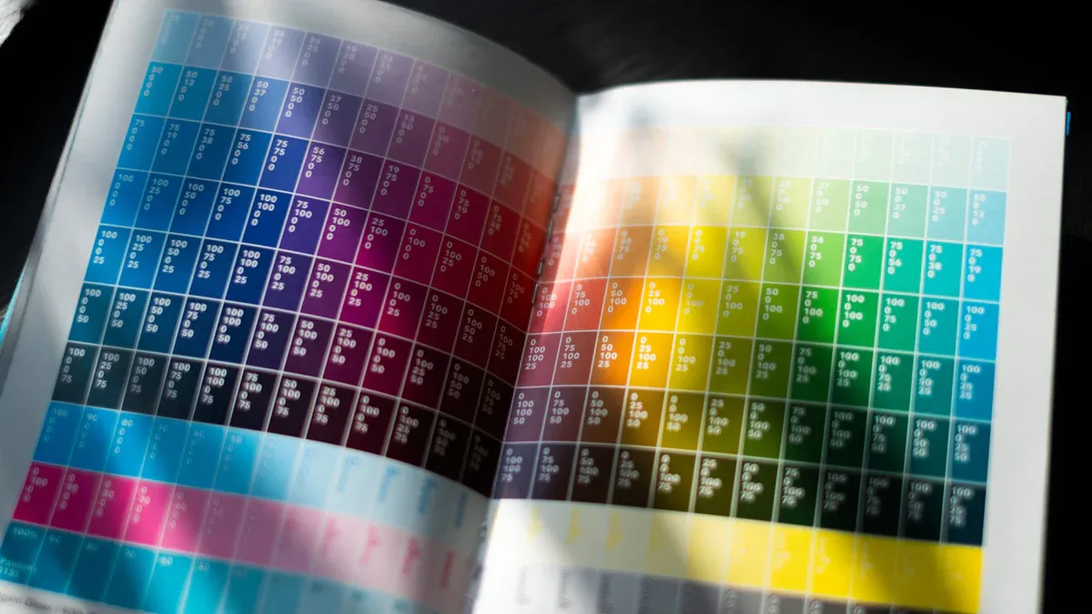
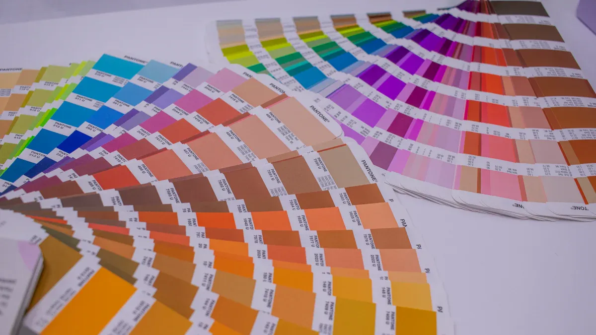
Pantone is the key to color consistency. A hotel must protect its brand identity. The Pantone Matching System (PMS) provides a universal language for colors. It ensures a hotel's signature blue on its hotel signage matches the blue on its website. This system offers a more extensive range of colors than standard printing.
The Pantone system uses meticulous design specifications for near-exact matches. This precision makes PMS a global standard for color reproduction in the hospitality industry. It helps a hotel match colors correctly across different materials.
Unlike other methods, Pantone offers specific palettes for various applications.
- Plastic palette
- Textile palette
- Print and graphics palette
This specialization guarantees that whether the custom signage is acrylic or the staff uniforms are fabric, the colors remain true. Brands like Hermès use a specific Pantone orange to signal exclusivity. A hotel uses its unique Pantone colors to build the same level of recognition for its signage.
Key Methods for Logo Printing on Acrylic

A hotel must select the right printing method to bring its brand to life on acrylic. The choice impacts durability, appearance, and cost. Each technique offers unique benefits for different types of hotel signage. Understanding these options is the first step toward flawless execution for any hotel project.
Direct UV Printing
Direct UV printing is a modern technique for applying images directly onto a substrate. A flatbed printer moves across the acrylic sheet, spraying tiny droplets of specialized ultraviolet ink. A built-in UV light instantly cures the ink, bonding it to the surface. This process allows for the creation of full-color, detailed images and logos. For extra vibrancy, a hotel can request a layer of white ink printed behind the color to make the design pop.
Pro Tip: For a unique, translucent effect on your hotel signage, a manager can ask the printer to omit the white ink base layer. This allows some light to pass through the colors.
| Aspect | Details |
|---|---|
| Pros | Vibrant colors, sharp graphics, and excellent durability. This method is versatile for creating complex, full-color designs. |
| Cons | The lifespan can be around 3-5 years, especially for outdoor signage exposed to direct sunlight and harsh weather. |
| Best Use Cases | Ideal for custom welcome signs, detailed room number plaques, and any hotel signage requiring photorealistic images or intricate logos. |
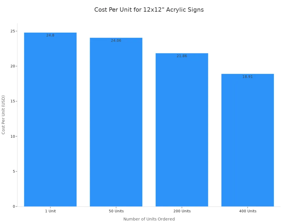
The cost of this printing method often decreases with volume. A hotel ordering a larger quantity of signs will see a lower cost per unit.
Second Surface (Subsurface) Printing
Second surface printing, or reverse printing, applies the logo and text to the back of a transparent acrylic panel. The design is printed in reverse so it appears correctly when viewed from the front. This technique places the acrylic material itself between the printed image and the outside world, offering superior protection. The thickness of the acrylic also adds a noticeable sense of depth and enhances color saturation, giving the signage a premium, high-end feel.
| Aspect | Details |
|---|---|
| Pros | Exceptional durability and protection from scratches, moisture, and UV rays. It creates a sophisticated, dimensional look that elevates the brand. |
| Cons | The process can be more complex and may have a higher initial cost compared to other methods. |
| Best Use Cases | Perfect for high-traffic areas like lobbies, corridors, and reception desks. A hotel should use this for key directional signage and ADA-compliant signs that require maximum longevity. |
This method is a top choice for luxury hotel properties. The inherent protection makes it a smart investment for any hotel signage that will face daily wear and tear.
Vinyl Application
Vinyl application is a traditional method for creating signage. A machine cuts letters and logos from sheets of colored adhesive vinyl. An installer then carefully applies these decals to the surface of the acrylic panel. For simple, single-color designs, this process is straightforward. The vinyl pieces often come with transfer tape to ensure proper spacing and alignment during installation.
| Aspect | Details |
|---|---|
| Pros | Cost-effective for simple text and single-color logos. It offers a wide range of standard colors and finishes, including matte and gloss. |
| Cons | Vinyl is susceptible to peeling, bubbling, and fading over time. Improper surface preparation or application in extreme temperatures can lead to failure. It is not ideal for complex, multi-color logo printing. |
| Best Use Cases | Best for temporary signage, informational signs that require frequent updates, or simple, one-color branding on interior doors or walls. |
Caution: A hotel must ensure the installer properly cleans the surface and applies the vinyl within the recommended temperature range (ideally 15–26°C). Insufficient pressure or trapped moisture can compromise the bond and lead to lifting edges. This is a critical detail for the longevity of the signage.
Choosing the right method is a balance of budget, design complexity, and desired lifespan for the custom hotel signage.
A Guide to Perfect Pantone Color Matching
Achieving a perfect custom color match is not a matter of luck. It is a process. This guide provides a hotel manager with an actionable checklist for flawless color reproduction. Following these three steps ensures a hotel's physical signage perfectly reflects its brand standards.
Step 1: Use Official Pantone Codes
The foundation of accurate color matching is the official Pantone code. A hotel must identify the exact Pantone Matching System (PMS) codes from its brand guide. These codes are a universal language for color. They tell a printer the precise ink formula required to create a brand's specific hue. A hotel should never guess or use a visual approximation.
A PMS color code removes all ambiguity from the process. It guarantees that the hotel's signature red on its lobby signage is identical to the red on its brochures.
It is also important to understand the suffix on a Pantone code. The letters indicate how a color will appear on different surfaces.
- Coated (C): This code is for glossy or coated surfaces like acrylic. Ink sits on top of the material, appearing vibrant and saturated. A hotel should use the 'C' code for most signage projects.
- Uncoated (U): This code is for porous surfaces like standard paper. The material absorbs the ink, which can make colors appear slightly duller.
A hotel must provide its signage partner with the correct Pantone code to start the project correctly.
Step 2: Prepare Correct Artwork Files
A printer needs the right type of file to produce high-quality signage. A hotel must supply its logo and graphics in a vector format. Vector files use mathematical equations to create images. This means a hotel can scale them to any size without losing clarity. A logo can look sharp on a small nameplate or a large exterior sign.
Raster files, like JPG or PNG, are made of pixels. They become blurry and distorted when enlarged. They are not suitable for professional logo printing. The best file formats for signage are vector-based.
| Format | Scalability | Color Support | Best Use for Hotel Signage |
|---|---|---|---|
| EPS | Infinite | CMYK, Pantone | The gold standard for large-scale prints. |
| AI | Infinite | CMYK, RGB, Pantone | Excellent for professional design and editing. |
| Infinite | CMYK, RGB, Pantone | A versatile format for general printing. |
Action Item: Before sending files, a hotel should instruct its designer to convert all text to outlines. This step turns text into a vector shape. It prevents font substitution errors if the printer does not have the specific font installed. This simple action protects the integrity of the custom signage design.
Step 3: Demand a Physical Proof
Never approve colors based on a digital screen. This is the most critical rule in color matching. Screens and printers produce colors in fundamentally different ways.
A digital screen uses the RGB (Red, Green, Blue) model. It creates colors by adding light. This is why screen colors often look bright and vibrant. A printer uses the CMYK (Cyan, Magenta, Yellow, Black) model or pre-mixed Pantone inks. This is a subtractive process where ink absorbs light. An RGB color on screen will almost always look different when printed.
A physical proof is the only way to verify color accuracy. It is a sample print of your design on the actual acrylic material. A hotel manager must review this proof in person under proper lighting conditions. Compare it directly to an official Pantone swatch from your brand guide. Do not proceed with the full production run until the proof is a perfect match. This step prevents costly mistakes and ensures the final signage meets the hotel's high standards.
Avoiding Common Pitfalls with Signage
A hotel can prevent costly errors in its signage system. Understanding material properties and partner qualifications is crucial. These factors directly impact the final look of the hotel signage and the overall guest experience. Careful planning ensures the hospitality brand is represented accurately.
How Acrylic Type Affects Color
The type of acrylic a hotel chooses significantly influences the appearance of printed colors. The substrate's base color alters the final look. A white acrylic provides a neutral base for accurate color matching. A clear acrylic makes colors appear translucent without a white ink underbase. This effect can be a design choice for custom hotel signage.
| Feature | Cast Acrylic | Extruded Acrylic |
|---|---|---|
| Color Range | Virtually limitless choice of colors | Smaller range of colors |
| Custom Colors | Offers custom color matching | Generally limited to standard colors |
The finish of the acrylic signage also changes color perception.
- Glossy Finish: This finish makes colors "pop" with high vibrancy. It is excellent for a hotel wanting a striking signage design.
- Matte Finish: This finish creates a more subdued, sophisticated look. It reduces glare and softens colors, which can enhance the guest experience in certain settings.
A hotel must consider these material properties for its hospitality signage.
Choosing the Right Printing Partner
Selecting the right partner is as important as the design itself. A hotel needs a printer with proven expertise in color management. The best partners often hold special certifications. This ensures the hotel signage meets brand standards.
The Pantone Certified Printer Program is the gold standard in the printing industry. This certification shows a supplier's commitment to color accuracy. The program involves a strict audit of a company's equipment, processes, and color management systems.
Working with a Pantone Certified Printer gives a hotel confidence. It guarantees the partner can reproduce brand colors flawlessly across all hotel signage. This expertise protects the hotel's investment and brand integrity. A qualified partner is essential for any hospitality signage project.
A hotel must create perfect signage. A hotel achieves flawless hotel signage by following key steps. This process ensures the final signage matches the hotel brand.
- A hotel must use official Pantone codes for all signage.
- A hotel must select the right printing method for the hotel signage.
- A hotel must verify the Pantone color with a physical proof for the signage. Following these steps ensures a hotel's physical branding is professional. A hotel should partner with a signage specialist for its next Pantone project. This ensures perfect Pantone signage for all hotel needs. The final signage will be perfect.
FAQ
How long does acrylic signage last?
The lifespan of acrylic signage depends on the printing method. Second surface printing offers the best durability. Direct UV printed exterior signage can last 3-5 years. Proper care extends the life of all hotel signage. This signage is a long-term investment.
What is the difference between wayfinding and identification signage?
Wayfinding signage guides guests through a property. Identification signage labels specific rooms or areas, like a spa or conference room. Both types of signage are essential for a positive guest experience. This signage must be clear and legible.
Why is a cohesive signage system important?
A cohesive signage system reinforces brand identity. Consistent design across all signage creates a professional look. This system improves navigation and elevates the guest's perception of the hotel. The right signage makes a big impact on visitors.
How can a hotel update its wayfinding signage easily?
A hotel can use modular systems for easy updates to its signage. Vinyl application on signage is also a cost-effective option for temporary changes. This approach keeps wayfinding signage current without replacing every sign.