Event Logo Printing Perfect Color Matching
Your branded materials demand perfect color matching. A color mismatch can lead to costly reprints, with some firms losing over ₹8 lakhs on a single event due to inconsistencies. This financial risk makes accurate color essential for every project.
To guarantee color accuracy in logo printing, you must use the Pantone color matching system. Provide your printer with a specific Pantone Coated (C) code for perfect color matching.
This professional printing method uses a pre-mixed Pantone ink. It ensures your final color is an exact matching result, unlike unreliable digital color models.
Why Use the Pantone Color Matching System?
You see a vibrant logo on your screen. You expect that same brilliant color on your final acrylic sign. Digital color models like RGB and CMYK often fail to deliver this result. The Pantone Color Matching System provides the solution for perfect color. It is the professional standard for brand consistency.
The Limits of CMYK/RGB on Acrylic
Your computer screen uses an RGB (Red, Green, Blue) model. It creates color by adding light, producing bright and vibrant images. Printers, however, use a CMYK (Cyan, Magenta, Yellow, Black) ink process. This process subtracts light from a surface. The range of CMYK color is much smaller than RGB. Bright screen colors like oranges and blues can appear dull or dirty when printed.
This problem becomes worse with acrylic. The material's own properties—like its transparency or base color—change how the final printed color looks. Unlike paper, acrylic does not absorb ink the same way. This makes CMYK an unreliable method for accurate color matching on this substrate.
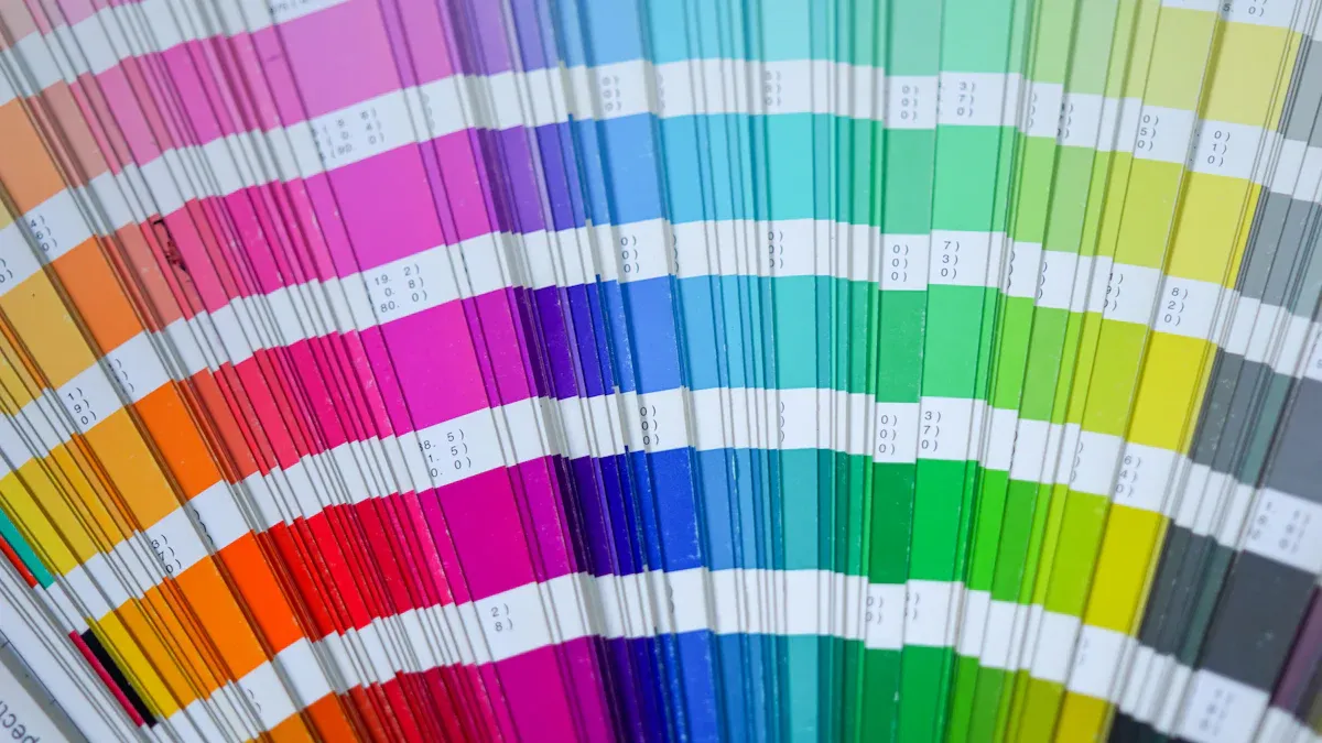
Pantone as the Universal Color Language
The Pantone Color Matching System (PMS) acts as a universal color language. It gives designers and printers a global standard for solid color printing. Each Pantone color has a unique code tied to a specific ink formula. When you give your printer a Pantone code, you are not just showing them a color; you are giving them a precise recipe.
This system removes guesswork. It ensures the color you approve is the exact color that gets printed, every time. This is why the Pantone system is the key to true color consistency.
Major brands build their identity around a specific Pantone color.
- Tiffany & Co. uses its iconic Tiffany Blue.
- Coca-Cola relies on its famous Coke Red.
- T-Mobile is known for its vibrant magenta.
These companies mandate a specific Pantone color to protect their brand. You must adopt this same professional standard. Using this color matching system and its specific color palette ensures your client's logo is perfect. This precise matching protects brand integrity across all event materials. The Pantone palette offers a wider range of colors than CMYK, including specialty shades for a high-impact finish.
Your Guide to Perfect Color Matching
Achieving perfect color matching requires a clear, step-by-step process. You can remove guesswork and guarantee brand consistency by following this professional guide. This approach ensures your final printed acrylics look exactly as intended.
Step 1: Identify the Pantone Code
Your first task is to find the official Pantone code for your client's brand color. This code is the foundation for accurate logo printing.
- Locate the Brand Style Guide: Most organizations have a style guide. You should request this document from your client. Look for the "Color" section inside the guide. The brand's primary colors will be listed there.
- Find the "Spot Color": Search for terms like "Spot Color" or "Pantone Color." These are the same thing. The guide should provide a specific pms color code, such as "PANTONE 185 C."
- Use Software as a Last Resort: If no brand guide exists, you can use software to find a close match.
- Adobe Illustrator: Use the color libraries in Illustrator to convert a CMYK or RGB value to the nearest Pantone equivalent.
- Other Tools: Some professionals use plugins like Pitstop, but these tools can sometimes produce lighter colors and offer less control.
Important Note: Software conversions are only an approximation. You must always verify the chosen color with a physical sample. This step is critical for accurate color matching.
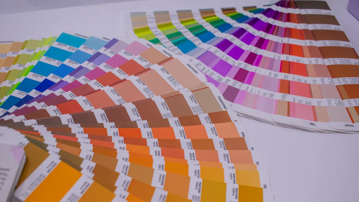
Step 2: Verify with a Physical Guide
A digital screen can never show you a true color. You must use a physical Pantone guide to see how the ink will look in the real world. This is the only way to confirm your color selection.
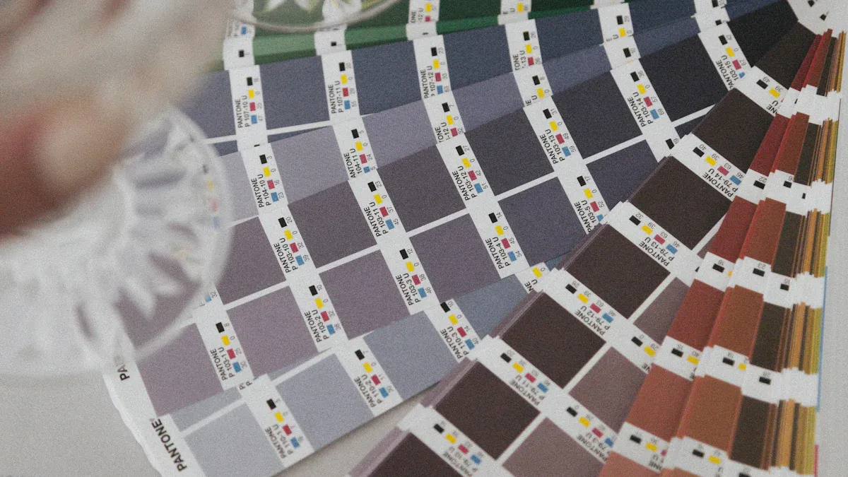
For printing on acrylic, you need the Pantone Color Bridge (Coated) guide. This tool is essential for two reasons:
- It shows the true spot color. The "Coated" (C) version shows how the ink appears on a glossy surface, which closely mimics acrylic. Uncoated paper absorbs more ink, making the same color appear darker and duller.
- It compares spot color to CMYK. The guide places the solid Pantone color directly next to its closest CMYK simulation. This visual comparison helps you manage client expectations. You can show them exactly why the Pantone printing process is necessary for achieving a vibrant, accurate color that CMYK cannot reproduce.
When you review the guide, view it in a controlled environment with good lighting. Daylight is ideal. Place the color swatch against a neutral white background for the most accurate assessment.
Step 3: The Process for Accurate Logo Printing
Clear communication with your print vendor is key to successful printing. You must provide them with precise instructions to ensure perfect matching.
Your artwork file, typically an Adobe Illustrator (.ai) or vector PDF file, must contain the correct color information. Make sure the logo's color fill is set to the specific Pantone spot color, not a CMYK or RGB value.
In all written communication, like emails and purchase orders, explicitly state the required code.
Example Communication: "Please print the logo using spot color PANTONE 185 C. Ensure a white ink underbase is applied for color vibrancy on the clear acrylic."
This level of detail leaves no room for error. Your printer will use this information to load the correct pre-mixed Pantone ink. They will configure their equipment to assign that specific ink to your logo, guaranteeing the final color is correct. This precise instruction is central to the color matching system.
Step 4: Request a Printed Sample
Before you approve the full production run, you must always request a physical proof. This is the most critical step for guaranteeing the final result. A printed sample shows you exactly how the Pantone ink will look on the final acrylic material.
A sample allows you to check:
- The accuracy of the color.
- The opacity of the ink.
- The effect of the white underbase.
Your printer may charge a small fee for this sample. This cost is a wise investment. It protects you from much larger expenses associated with reprinting an entire batch of incorrectly colored materials. Approving a physical sample is the only way to manage client expectations effectively and sign off on the project with complete confidence in the color matching.
Technical Keys for Printing on Acrylic
Beyond the Pantone code, two technical choices will make or break your final product: the ink application and the material finish. You must specify these details to your printer for a successful outcome.
The Role of a White Ink Underbase
Printing directly onto clear or colored acrylic makes inks appear transparent and washed out. You need a white ink underbase to create an opaque foundation for your logo. This layer is essential for achieving vibrant, accurate color. It works by blocking the acrylic's color from showing through and reflecting light back through the ink, which makes your design pop.
Your print vendor will use specific technology for this process.
- UV Flatbed Printers: This equipment is the industry standard for this type of printing.
- Instant Curing: The printer uses UV light to cure the ink instantly.
- Strong Bond: This process ensures the ink bonds strongly to the acrylic surface for a durable finish.
Pro Tip: Always specify a white ink underbase. It is the key to making your colors look as bright and solid on acrylic as they do in your Pantone guide.
Choosing the Right Acrylic Finish
The finish of the acrylic itself affects how people see your logo. Your choice between matte and gloss will impact readability and perceived color intensity, especially under event lighting. This makes the right finish crucial for effective logo printing.
Consider how each finish performs:
| Finish | Light & Glare | Color Appearance | Best For |
|---|---|---|---|
| Matte | Diffuses light, reduces glare | Softer, more subdued | High readability in bright areas |
| Gloss | Reflects light, can cause glare | Richer, more vibrant | Attracting attention from a distance |
For high-traffic areas where signs might be touched, a matte finish is superior. Its textured surface is designed to hide fingerprints and scratches, keeping your signage looking professional throughout the event. This final printing decision protects your investment.
Your diligence in color matching protects brand integrity. For successful logo printing, you must use the Pantone color matching system. This professional color matching system is non-negotiable for your branded materials.
Your Action Plan for Perfect Color Matching:
- Verify your Pantone color with a physical Pantone guide.
- Specify a white ink underbase for your printing.
- Approve a physical sample.
This precise matching ensures your branded materials deliver high impact. The Pantone system avoids risks and ensures a flawless final color.
FAQ
What if my client's brand guide only has CMYK/RGB values?
You must convert the digital color to its closest Pantone match. Use a tool like Adobe Illustrator for an initial conversion. Then, you must verify this choice with a physical Pantone Color Bridge guide. This step ensures real-world accuracy for your logo printing.
Can I skip the printed sample to save money?
You should never skip the printed sample. This small investment protects you from costly reprints. A physical proof is the only way to get final client approval with confidence. It guarantees the color and finish are perfect before the main production run.
Why is a 'Coated' (C) Pantone guide so important?
The 'Coated' guide shows how ink appears on a glossy, non-absorbent surface. This surface closely mimics the finish of acrylic. Using this guide gives you the most accurate preview of your final printed color, preventing unexpected results on your event materials.
Does the color of the acrylic affect the logo?
Yes, the acrylic's color can alter your logo's appearance. A white ink underbase is essential. It creates an opaque barrier.
This barrier stops the acrylic color from showing through. It makes your logo's colors appear vibrant and true to the Pantone standard.