Your Guide to Flawless Logo Printing
To achieve perfect brand color on acrylic, you must use the Pantone Matching System, provide vector logo files, and approve a physical proof.
A consistent color can boost brand recognition by up to 80%. This guide ensures your premium brand image is perfectly reflected on all packaging. You can master the Pantone logo printing process for flawless custom packaging and displays, protecting the integrity of your brand's unique logo.
THE ROLE OF PANTONE IN BRANDING
Your brand’s color is its signature. To protect that signature, you need a universal language for color. The Pantone Matching System (PMS) provides that language. It assigns a unique code to each color, ensuring the shade you approve on-screen is the exact shade that gets printed. This system eliminates guesswork and guarantees color consistency across all your branded materials.
WHY PANTONE IS ESSENTIAL
Inconsistent colors can damage your brand's reputation and lead to costly reprints. Using the Pantone system is your best defense against these risks. When you provide a specific Pantone (PMS) code, you set a clear, non-negotiable standard for your printer. This ensures precise color accuracy for your branding. This process avoids the confusion that leads to:
- Negative Brand Impact: Mismatched colors dilute your brand identity.
- Increased Costs: Inaccurate color reproduction requires expensive and time-consuming corrections.
- Loss of Credibility: Poor color matching reflects poorly on your attention to detail.
PANTONE VS. DIGITAL COLORS
The colors you see on your computer screen (RGB) are not the same as the colors a printer uses (CMYK). Digital and print use different methods to create colors, which is why you cannot rely on them for physical color-matching. You must convert cmyk to pantone for accurate results.
| Aspect | RGB (Digital Screens) | CMYK (Process Printing) |
|---|---|---|
| Color Model | Additive: Mixes Red, Green, and Blue light. | Subtractive: Mixes Cyan, Magenta, Yellow, and Black ink. |
| Best For | Websites, social media, digital ads. | Paper flyers, magazines, brochures. |
CMYK printing struggles to reproduce vibrant colors and its results can vary between printers. It often fails at precise color matching. Pantone (PMS) colors solve this problem. A Pantone color is a specific, pre-mixed ink used in spot color printing. This method uses a single run to apply your exact color, creating a pure, solid, and vibrant finish that CMYK cannot guarantee. If you need to convert cmyk to pantone, specialized tools can help, but starting with a Pantone color is always best.
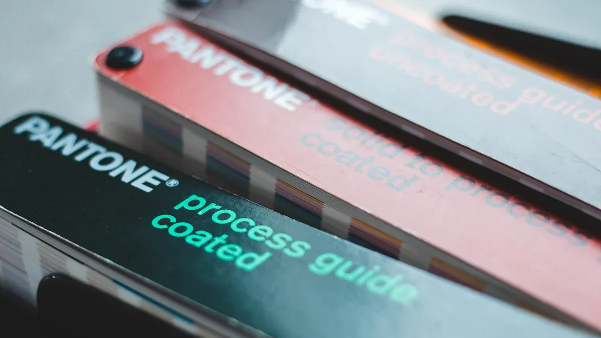
THE SOLID COATED GUIDE
Pro Tip: For printing on non-porous materials like acrylic, always specify colors from the
Pantone Formula Guide (Solid Coated).
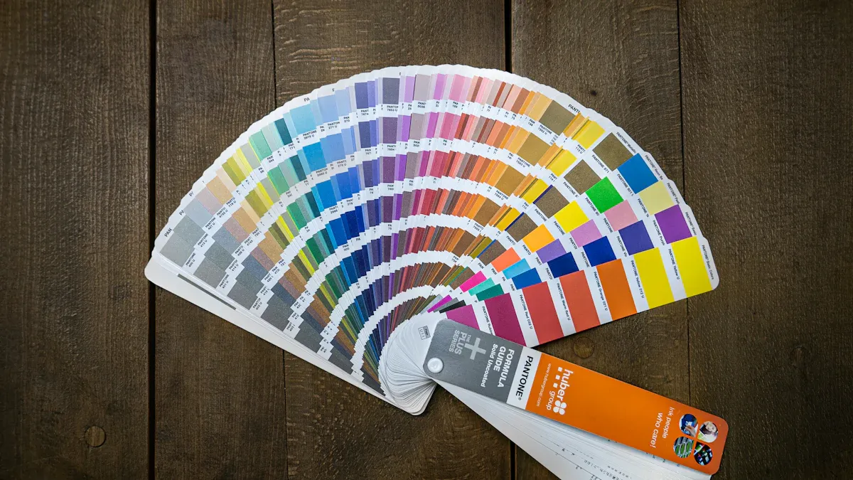
You must direct your printer to the correct Pantone color book. The "Coated" guide is designed for materials that do not absorb ink, ensuring the final color appears rich and true to your PMS specifications. This guide contains over 2,390 market-driven colors, giving you a vast palette to perfect your brand’s look. When you need a custom pantone ink for perfect color-matching, this is your definitive reference. You can confidently convert cmyk to pantone specifications using this guide for flawless matching.
PREPARING YOUR FILES FOR LOGO PRINTING
Submitting the correct file is as important as choosing the right Pantone color. Your printer needs a high-quality blueprint to produce a flawless result. Proper file preparation prevents delays, extra costs, and disappointing outcomes in your logo printing project.
THE NEED FOR VECTOR FILES
You must provide your logo in a vector format. Common vector files include AI, EPS, and SVG. Vector graphics use mathematical equations to create shapes. This means you can scale them to any size without losing quality. Your logo will look sharp on a small component or a large display.
Raster files, like JPG or PNG, are different. They are made of tiny squares called pixels. When you enlarge a raster image, the pixels stretch and become visible. This causes the logo to look blurry or "pixelated." Using a raster file for logo printing will compromise the clarity of your brand's mark. Always insist on vector files for any printing job.
EMBEDDING PANTONE CODES
Your design file must contain the correct Pantone (PMS) color information. A common mistake is creating a file in the wrong color mode, like RGB, which is for screens. Print files must use specific PMS color codes for spot color printing. When your designer sets up the file, they assign your chosen Pantone (PMS) code directly to the logo. This embeds the exact color formula, telling the printer precisely which Pantone ink to use.
Pro Tip: Ask your designer to confirm that the file is set up with Pantone (PMS) spot colors, not CMYK or RGB colors. This simple check ensures the printer receives the correct instructions for your brand's specific colors. An incorrect setup can make your vibrant Pantone colors appear dull.
FINAL FILE HANDOFF
- ✅ File Format: Is the file a vector format (AI, EPS, or PDF)?
- ✅ Pantone (PMS) Colors: Did your designer embed the correct Pantone (PMS) spot colors? Confirm the specific PMS codes are used.
- ✅ Outlined Fonts: Are all text elements converted to outlines? This prevents font issues if the printer doesn't have the same fonts.
- ✅ Clean Artwork: Is the file free of stray elements or hidden layers? The file should only contain the final logo artwork.
Following these steps guarantees that your printer has everything they need to reproduce your brand’s color and logo with perfect accuracy.
PRINT METHODS FOR ACRYLIC COLOR-MATCHING
Choosing the right print method is crucial for perfect Pantone color-matching on acrylic. Your choice depends on your project's volume, design complexity, and budget. Understanding each method helps you achieve the best results for your custom packaging.
UV PRINTING FOR VIBRANCY
UV printing offers exceptional quality for detailed logo printing. This method uses ultraviolet (UV) light to instantly cure ink on the acrylic surface. This process ensures your Pantone colors are vibrant and precise.
- Enhanced Vibrancy: The instant drying process prevents ink from spreading. This creates crisp, high-resolution images with a wide gamut of colors. Your logo will have excellent color fidelity and sharpness.
- Improved Durability: UV-cured inks are highly resistant to fading, scratching, and weather. This makes them ideal for both indoor and outdoor applications, ensuring your logo remains intact over time.
UV printing is superior for any custom project requiring textured effects, high-resolution details, and brilliant Pantone colors. It is the top choice for premium custom branded packaging where visual impact is key.
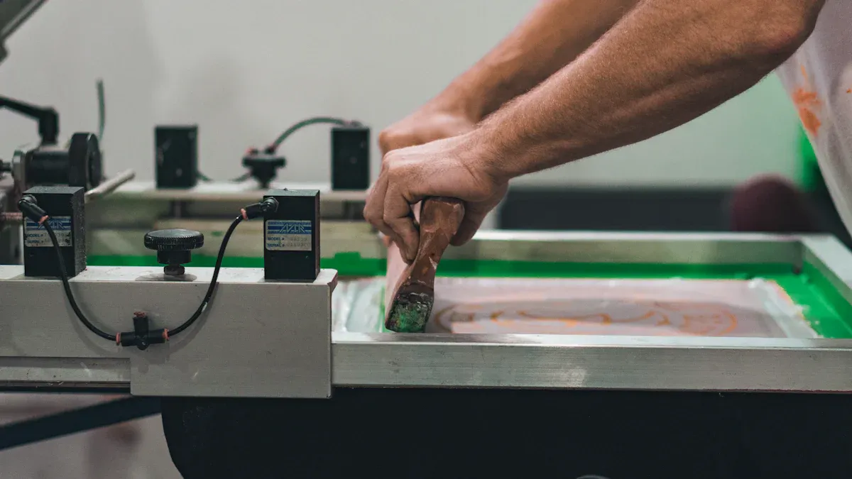
SCREEN PRINTING FOR VOLUME
Screen printing is a traditional method that is highly effective for large orders. It involves pushing ink through a mesh screen onto the acrylic. Each Pantone color in your design requires a separate screen.
For production runs exceeding 500 pieces, screen printing offers the lowest cost-per-print. This makes it a practical choice for bulk orders with simple logo designs and solid Pantone colors.
However, screen printing has limitations. It struggles to reproduce fine details or complex gradients. Using multiple colors increases cost and complexity, as each color needs a unique screen. This can create challenges with precise color matching alignment. This method works best for simple designs with a limited number of solid colors.
APPLICATIONS IN CUSTOM BRANDED PACKAGING
Your choice between UV and screen printing directly impacts your custom branded packaging. The right method ensures flawless color-matching for your brand’s unique Pantone colors.
- Choose UV Printing for premium or limited-edition packaging. It excels at reproducing intricate designs and vibrant colors, reflecting a high-end brand image. This is perfect for custom displays and luxury product packaging.
- Choose Screen Printing for large-volume packaging needs, like promotional items or standard product lines. It provides a cost-effective solution for simple, bold logos with one or two Pantone colors, ensuring consistent color matching across thousands of units.
Properly matching the print method to your design ensures perfect color reproduction for all your custom packaging.
MASTERING THE COLOR MATCHING & PROOFING PROCESS
You have prepared your files perfectly. Now you enter the most critical phase: the proofing process. This stage turns your digital design into a physical product. It is your final chance to guarantee perfect color-matching before full production begins. Success here protects your investment and your brand identity.
FROM DIGITAL TO PHYSICAL PROOF
A digital proof is only a preview. Your screen cannot show you the true final color. You need a physical proof to see the real result. This physical sample, printed on the actual acrylic, shows you exactly how your Pantone colors will look. This step is essential for accurate color matching.
Printers follow strict industry standards to create reliable proofs. These standards ensure the sample you receive is a faithful representation of the final product. Key standards include:
- ISO Profiles: These create a standard for press operations. They enable accurate proofs and color separations.
- Ugra/Fogra Media Wedge: This is a control strip printed alongside your design. Your printer measures it to confirm the proof’s quality against standard data.
- ICC Profiles: These digital files are vital for proofing. They help manage colors across different printing processes, ensuring consistency.
Following these standards allows your printer to create a proof that accurately reflects your chosen Pantone colors.
REVIEWING YOUR STRIKE-OFF
Your printer will provide a physical sample called a "strike-off." A strike-off is a test print of your logo on the final material, or substrate. Its purpose is to verify print quality, scale, and, most importantly, color accuracy. This sample is your single source of truth for color-matching. It shows you exactly how the Pantone ink appears on the acrylic. You can assess how the material reflects the Pantone colors and confirm the artwork scale before committing to a large order.
Pro Tip: Always review your strike-off under standardized D50 lighting conditions. A D50 light box simulates neutral daylight. This removes the guesswork caused by office lights or sunlight, which can alter how you perceive colors.
When you review the strike-off, compare it directly to your physical Pantone Formula Guide. Do not use your screen for this comparison. Check that the printed Pantone colors are a perfect match to the swatch in your guide. This careful matching ensures the final product will meet your brand's exact specifications for its unique colors.
APPROVAL AND PRODUCTION
Your approval of the strike-off is the final green light for production. This step confirms you are 100% satisfied with the color-matching and overall quality. Once you give your approval, the printer will use the approved strike-off as the master guide for the entire production run. Every subsequent piece will be produced to match that exact standard.
Communicate your decision clearly. If the Pantone colors are perfect, provide a signed approval. If the color is off, provide specific feedback referencing your Pantone guide. For example, you might say, "The blue is too dark compared to Pantone 285 C." This clear communication prevents errors and ensures the next sample will be a closer match. Your final approval locks in the color and begins the journey to a flawless final product.
You can now master your logo printing. This guide ensures your brand achieves perfect Pantone colors for all packaging. Your packaging reflects your exact Pantone color.
Your Final Checklist for Flawless Packaging:
- ✅ Use
PantoneSolid CoatedPantonecodes for yourcolors. - ✅ Provide vector files for your
logo. - ✅ Select the right print method for your
packaging. - ✅ Approve a physical proof to match your
Pantonecolors.
Following these steps protects your visual identity. You will achieve flawless Pantone colors on all packaging applications. Your Pantone colors, Pantone colors, Pantone colors, and Pantone colors will be perfect.
FAQ
What if my brand uses multiple colors?
You must provide a specific pantone code for each of your brand's colors. Your designer will assign these codes to the correct parts of your logo in the vector file. This ensures all your custom colors are printed with perfect accuracy. The final colors will match your brand's unique colors.
Can I use a JPG file for my custom logo?
You should not use JPG files for printing. JPGs are raster files and will look blurry when scaled. You must provide a vector file (AI, EPS, PDF) for your custom logo. This guarantees your logo's colors and lines remain sharp. Your brand's colors will look perfect.
Why are my screen colors different from the printed colors?
Your screen uses RGB light to create colors. Printers use ink to produce colors. These two methods create colors differently. This is why you must use the pantone system for your custom packaging colors. It guarantees your final colors match your intended colors.
Do I really need a physical proof for my custom project?
Yes, you must approve a physical proof. It is the only way to see how your brand's colors will look on the final material. This step confirms the quality of the colors before you commit to a full production run. It protects your brand's specific colors.